客户名称 : Natural
服务内容 : 面包店品牌VI设计 北京logo标志设计
创作日期 : 2016-01-01
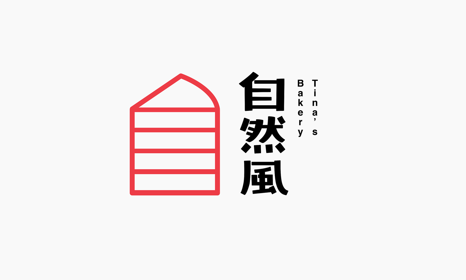

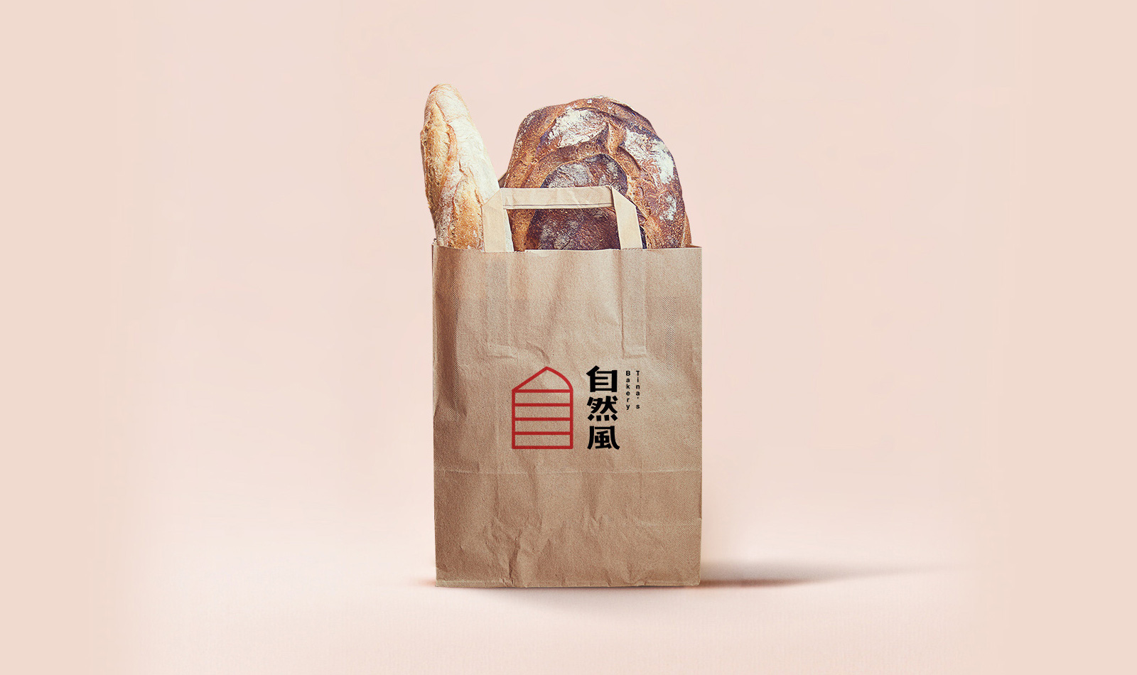
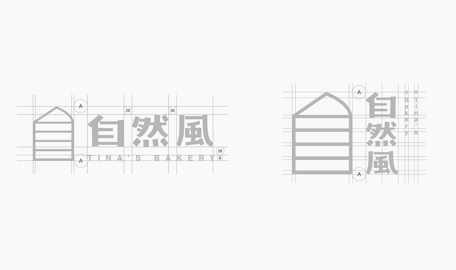
“自然风” 想传达的也是给人最天然的味觉, 希望你咬下一口蛋糕的时候能感受到大自然的清新和微风一般的舒适 。所以字体设计上尽量保持纯粹简单,笔画像树木一样粗细不等, 左边的图形还原蛋糕切下去最原始的状态,耐看又不失设计感,整体搭配上给人一种亲切感和清新感。
"natural wind" wouldlike to convey is also the most natural taste, l hope you bite a cake when Feel the fres-hness of nature and the comfort of the wind. So the font design as far as possible to maintain a simple simple, strokes of a characterlike the same thickness of trees, theleft side of the graphics to restore the cake, The most simple state, attractive and yet a sense of design, the overall mix of people with a sense of intimacy and freshness.

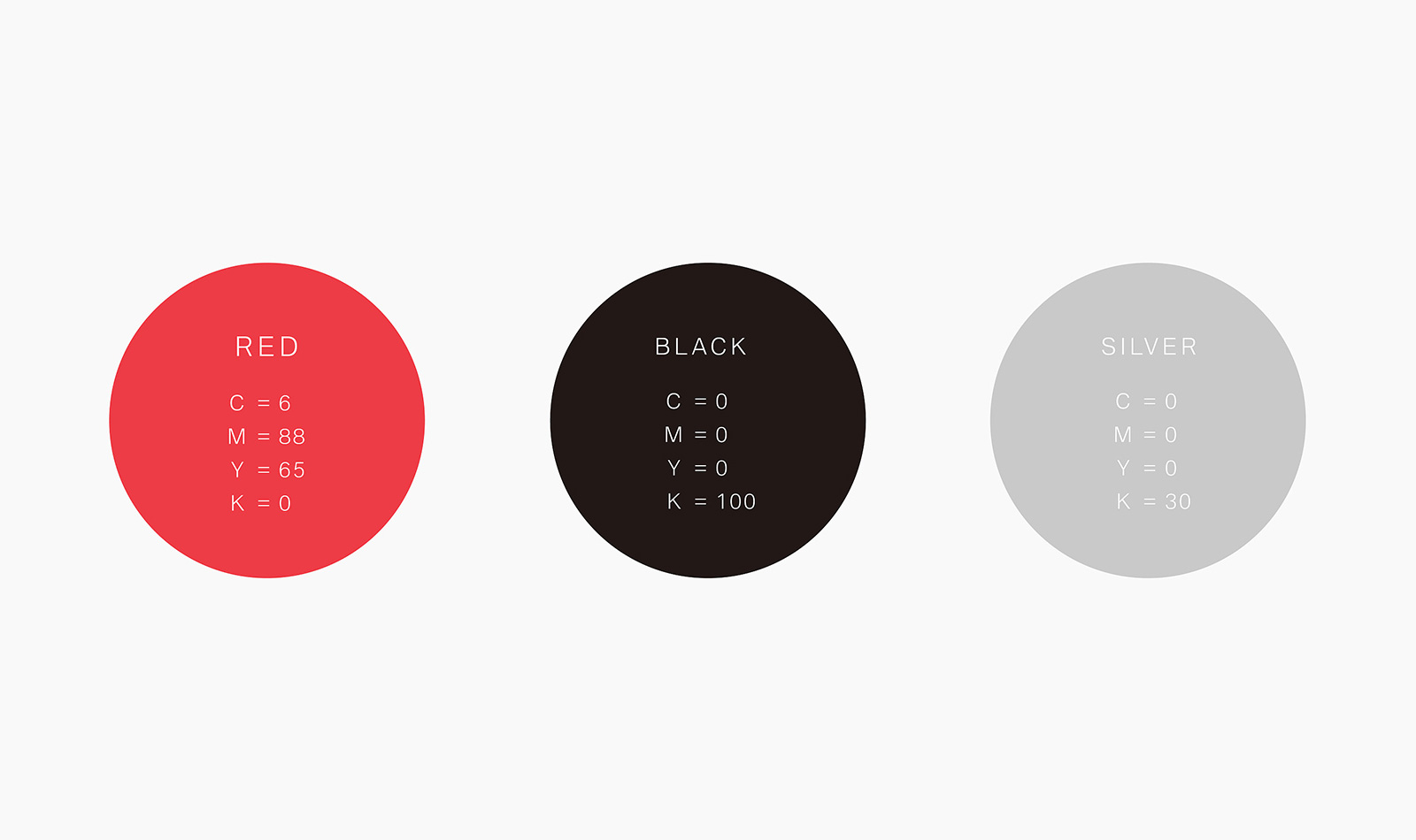
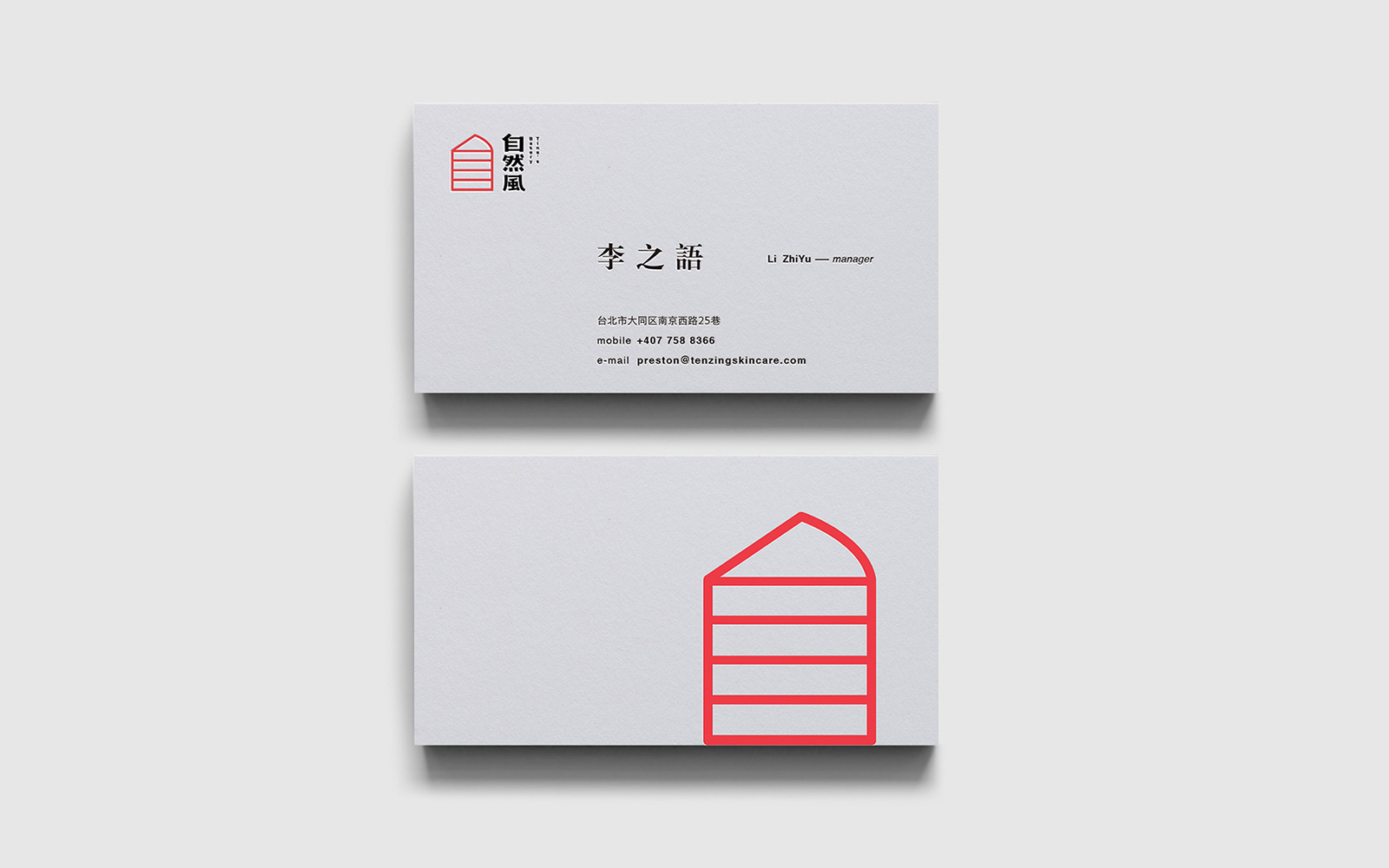
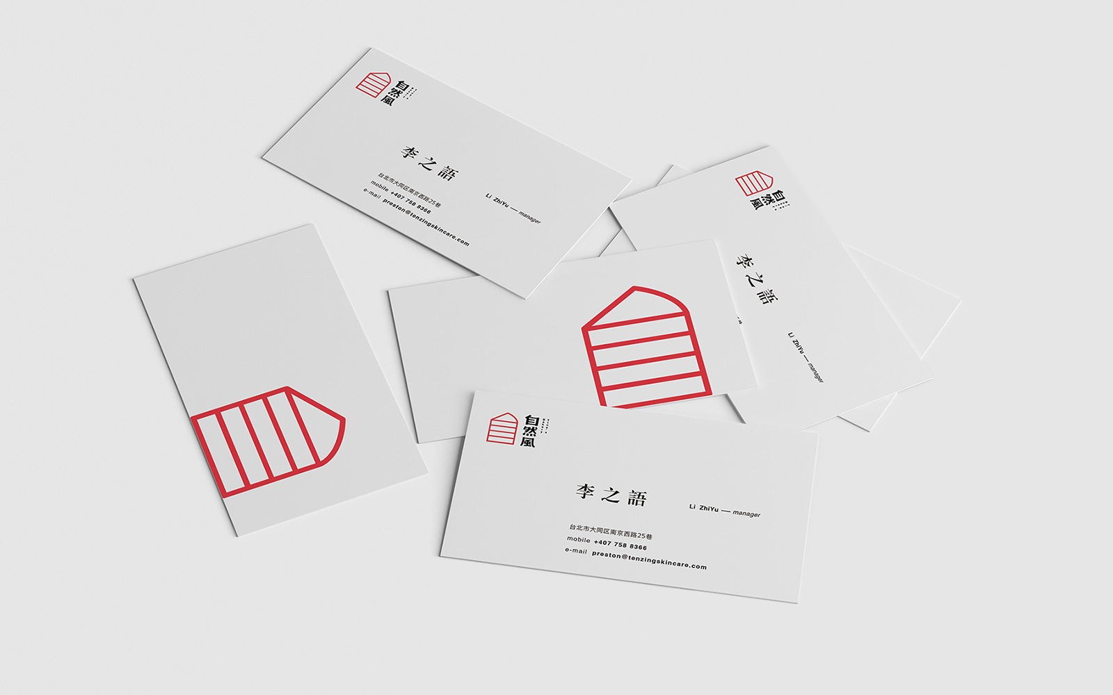
左边图形用红色呈现, 给人一种明朗轻快的感觉, 明朗轻快的色调不但能增进就餐者的兴致, 刺激食欲, 而且能营造一种温馨甜蜜的氛围。右边的文字则用黑色, 显得比较稳重大方, 红与黑的搭配也增添了强烈的对比, 背景颜色使用浅灰色, 显得更加高级 。
Theleft figure is shown in red, giving a clear and brisk feeling, and the bright and brisk tones can not only enhanoe the appetite of the diners, but also stimulate the appetite oan create a warm and sweet atmosphere. The text on the right is black, itlooks more sedate and generous, and the combination of red and black adds a strong contrast,The background color islighter and more advanced.
